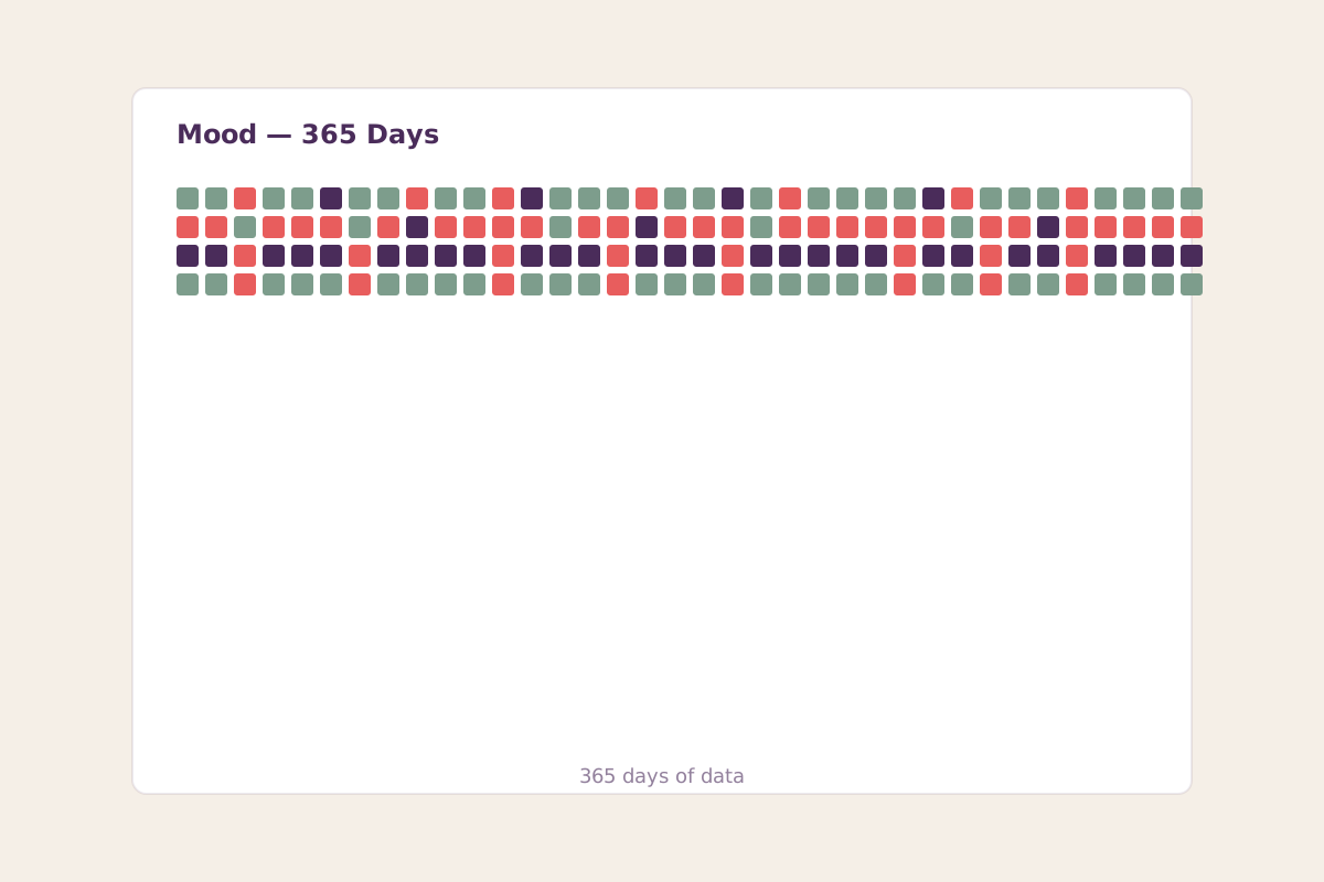
On January 1st of last year I started rating my mood every evening on a 1–5 scale. One number, thirty seconds, done before I turned off the lamp. I wasn't trying to optimize anything. I was just curious whether the stories I told myself about my own emotional patterns would survive contact with data.
They mostly didn't. Here's what a year of mood tracking actually revealed.
The Method
One entry per day, in the evening. A single integer from 1 (terrible) to 5 (excellent). No qualitative notes — I'd tried mood journaling before and the friction killed it. A bare number I could log in five seconds survived all 365 days without a single missed entry.
The scoring was instinctive, not clinical. I didn't define what a "3" meant. I trusted that the gut-level rating would average out to something meaningful over enough days, and it did. The lack of rigor was a feature: a system I'd actually maintain beats a system I'd abandon.
Pattern 1: The Seasonal Trough Was Real — and Predictable
I've always suspected I get a mild winter dip. The data confirmed it, but not where I expected. My lowest week wasn't the darkest week of December — it was the third week of January, every year. My average for that specific week across two years of data: 2.7. Compare that to my summer peak in late July: 4.1.
What I hadn't connected was that this January trough lined up exactly with the post-holidays return to routine, which for me is a combination of (a) daylight still being scarce, (b) the motivational hangover of failed New Year's experiments, and (c) a genuine workload spike. The data let me see this as a predictable trough rather than a personal failing. I now plan January as a low-expectation month. This is the single most useful thing the tracking gave me.
"The data let me see the January trough as a predictable trough rather than a personal failing."
Pattern 2: Tuesdays Are My Best Day
This was the surprise. When I broke the year down by day of week, Tuesday had the highest average — 3.8, against a weekly mean of 3.4. Monday was the lowest at 3.1, which I expected. But I'd always assumed Friday or Saturday would be the peak. They weren't. Saturday came in at 3.6, Friday at 3.5.
The theory, after staring at this for a while: Tuesdays are when I've recovered from the Monday activation cost but haven't yet accumulated the week's fatigue. It's the sweet spot. I now schedule my most demanding creative work on Tuesdays because the data says that's when I have the most headroom. I would never have discovered this without tracking. My intuition was wrong.
Pattern 3: The Best Predictor of Tomorrow's Mood
I ran a crude analysis: for each day, I checked the previous day's mood, the previous night's sleep (from my sleep tracker), and whether I'd exercised. The strongest single predictor of tomorrow's mood wasn't sleep, and it wasn't exercise. It was whether I'd journaled the evening before.
Days following an evening journal entry averaged 3.7. Days with no journal entry averaged 3.2. I cannot prove causation — it's entirely possible that good days make me more likely to journal, rather than journaling making the next day better. But the correlation was consistent enough across the year that I've stopped questioning it and just journal.
Pattern 4: The "Bad Stretch" Illusion
Here's the thing tracking did that nothing else could: it broke the bad-stretch illusion. You know the feeling — you have three rough days in a row and your brain tells you "this is just how things are now, it's been bad for ages." Looking at the data, my longest run of consecutive 2-or-below days was four. Four. My subjective sense during that stretch was that it had been "weeks." The data showed me, unarguably, that my memory of negative periods is inflated by about 3x.
Now when I feel like I'm in a slump, I check the actual numbers. About half the time, the "slump" is one bad day that I've mentally generalized into a pattern. Seeing the real data snaps me out of it faster than any cognitive reframing technique I've tried.
Pattern 5: I Am More Stable Than I Think
My year broke down roughly like this:
- Days rated 5: 41 (11%)
- Days rated 4: 167 (46%)
- Days rated 3: 112 (31%)
- Days rated 2: 38 (10%)
- Days rated 1: 7 (2%)
Over 76% of my days were a 3 or above. Only 2% were genuinely bad. This was — honestly — moving to see. I had carried a vague narrative that I was "moody" or "up and down," and the data showed a life that is mostly fine with occasional dips. I am, it turns out, a fairly stable person who was telling myself a less stable story.
What I'd Do Differently
If I were starting over, I'd add one qualitative tag to each entry — a single word ("work," "family," "sick," "travel"). The bare number is enough to see patterns, but it can't tell you why a given week dipped. I retroactively guessed at causes for my troughs, but I can't verify them. A one-word tag would have given me the layer I'm now missing.
I also wouldn't recommend daily mood tracking to everyone. For some people, monitoring mood closely increases anxiety about mood. I have a friend who tried it and became more neurotic about her emotional state, not less. If you're prone to that, weekly check-ins are better than daily. The data is less granular but the cost to your peace of mind is lower.
The Unexpected Payoff
I expected the data to help me see patterns. I didn't expect it to make me gentler with myself. There's something about seeing 365 colored squares, the vast majority of them in the "fine to good" range, that quietly corrects the negativity bias we all carry. I don't look at the grid often. But I know it exists. And knowing that the record exists — that the bad days are documented as temporary, and the good days outnumber them — has changed my relationship with the rough ones.
That alone was worth the thirty seconds a day.
This article is part of DaveLog's Personal Experiments series. The mood tracking continues — year two is in progress.